August 19, 2006

Robot Rabbit (1953)


Robot Rabbit
1953-12-12
Friz Freling
See
http://hellonfriscobay.blogspot.com/
for the Friz Freling Blogathon, which this post has been made because of.

Love:


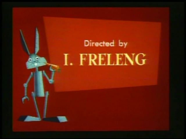
Title card painting. The weird angles on the robot Bugs are pleasing, as are the colors.

"Downa Indiana way..." Technically known as "In a Little Red Barn (On a Farm Down in Indiana)", the song is cool as a setup for bringing Elmer and Bugs together. It's not as well done as the opera singer using the song to bring Bugs and his antagonist together, but it's still cool.
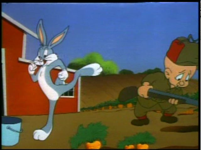


Kick the bucket. Having Bugs and Elmer sing together again is kinda repeptitive, but the whole kick the bucket thing is a prime combination of a physical gag with verbal humor, as well as comic misdirection of the antagonist, followed by ...


Elmer's disengegement, the classic end to the playalong joke. The buggy in the barn is great in silhouette, too. Unfortunately, it goes on too long with Elmer stunned, and just ends up kinda falling flat as it drags on. Fortunately, the disengagement is followed by Bugs jumping in a hole leading to...


Flopping carrots. It's very satisfying for Bugs going to ground so hard that the carrots in his hole bounce like popcorn on a tympani.
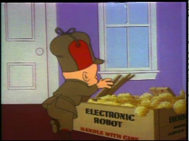


Electronic Robot box. Mmm, paintings. The text is straight forward, and the font conveys plenty about the product without a messy little logo. Technical manual writers would do well to study the branding of the Electronic Robot line of products.
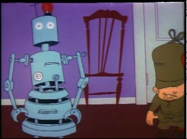


Flopping robot. Before there were flopping carrots, afterwards, its ass will fall off. Here is the middle state; starting up, the thing is shaking apart at the seams. Not the best idea in designing your robot, I think you'll agree, but it looks cool on screen.


Future gun. Great painting, great gun design. If only the entire cartoon had the color sense of the paintings...


Donkey's "whad I do? Whad I do?". The line is great. His post blasting head is as ugly as the testicle hanging out of the shorts of the old guy down the street, tho.


Evil painted robot. A still painting plus cels conveys a lot of anger and frustration.
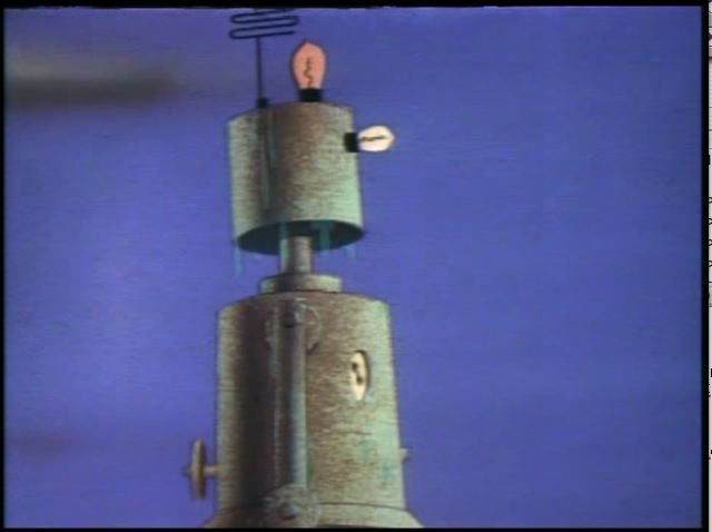


Rusting painted robot. The sound of Elmer's oil can is cool with this, combined with the painting itself and the rusting effect is just a very tasty visual.

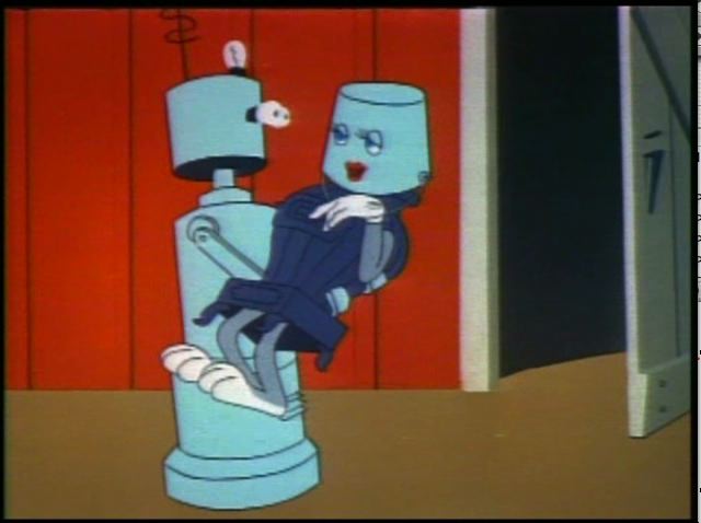


Robo drag. When Bugs is ugly (like in this cartoon), there's nothing like putting a bucket on his head to make a robot want to fuck him...
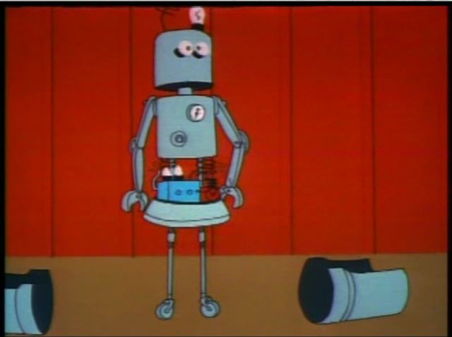


Robot falling ass, now with sputtering! I wonder if the sides flying off is what caused the robo bottom to drop out, or if the bottom was falling and in a safety measure the sides were blown off like a cockpit in a fighter plane...


Hate:
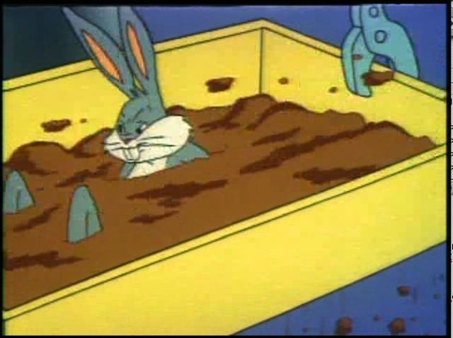


Ugly bugs. He's off kilter in the box, but the problem with this and most of the Freling cartoons is that Bugs looks boring/ugly. Chuck Jones got out of control later on, but at least his Bugses (yeah, I spelled it) were always interesting (by the '50s, at least).

Lame Elmer and Bugs interaction. Elmer is frustrating, Bugs is irritating. Gee, just what I want to see. And when they get together? Oh, the crappiness... It's like they're actors sleepwalking through cliched roles they've done a thousand times before.

"A wobot pest contwoller with an ewectwonic bwain?" Too much of a speech impediment drags down a cartoon.

Failed mistaken identity joke. Elmer getting shot by the robot here isn't as well done (not nearly) as in the Daffy/Bugs/Elmer Chuck Jones trilogy.

Having the robot crushing money shot off screen. I can't see why this would be an edit for television. It feels like the gag was designed to have a reveal, but it was hardly unexpected based on the shot leading to the fadeout. If the entire cartoon hadn't been leading to it (like, if it was just one of many minions Elmer had been sending after Bugs, and it wasn't the final gag) this would be ok. As is, the cartoon just sorta ends, giving the viewer cartoon blue balls.


Ugly colors. The painted figures are great, but they underscore the crappiness of the rest of the color scheme. The outdoor scenes on the farm are full of reds and greens that make me want to crawl into a cave to escape them.

All in all, I don't this cartoon as much as I did when I was a kid. It still has its virtues, tho...

August 12, 2006

Felix in Hollywood

Felix in Hollywood
1923

If the page is functioning, you can download or stream this cartoon at:
http://www.archive.org/details/Felix_inHollywood_NoAudio


Love:

The main title card. It's pretty good; it could be better but the basic idea (of looking interesting) is there.


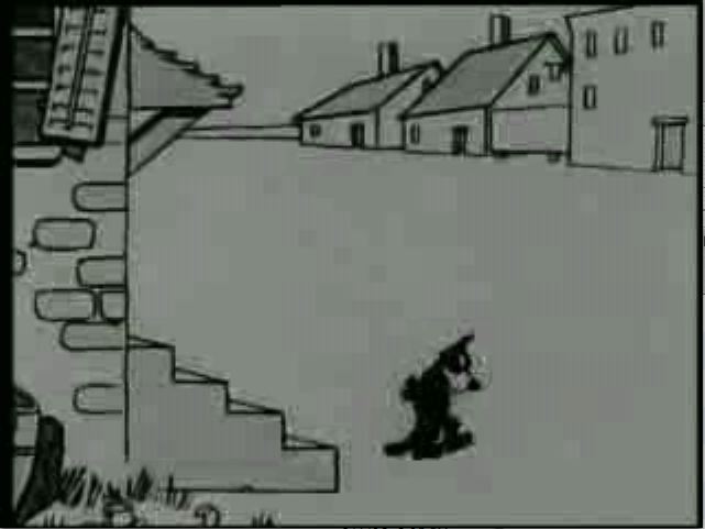
Lots of weird open spaces. It's unusual to see such big dead spaces. That makes it interesting as a change. It's irritating over time tho.


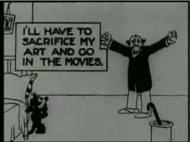
Freaky word boxes. The action just stops when the word boxes come up. Again, interesting for a change, altho even as a novelty the complete stop to animation during the wordbox is irritating.


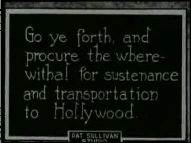
"Go ye forth" intertitle card. Wordboxes and intertitles. Hmmm. I think they'd be better off with just the intertitles. The writing is completely over the top on this one, and that's cool. The lettering is also pleasantly odd, the way the Ls and Ds have right pointing flags and the Hs have left pointing flags. Do those even count as serifs?


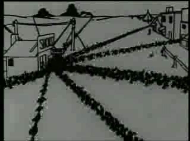
Weird 3D looking background houses. The super flatness of everything else makes them look like Fleischer 3D backgrounds in comparison.


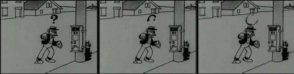
1¢ gum on a pole. Everyone loves 1¢ gum on a pole...


Animated question mark. A nice little animated touch that's expanding on 2D conventions.


Super 3d stars. Every really well done thing sticks out in the film. It's very short tho, and moving so quickly...

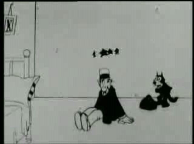
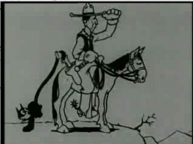
Felix hiding as an umbrella and then a bag. No stills illustrate it well; it's just a cool type of thing (probably way less cool at the time, as that was the kind of thing they seemed to really overuse, and they were banging out a huge number of Felix the cats; at least from the point of view of now, considering the extremely low visibility the Felix cartoons have now; Felix was a huge franchise, until a perfect storm hit and basically killed him in cartoons (if not comic strips) for decades).


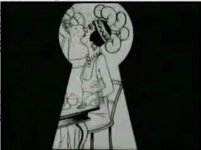
Unidentifiable female star, in a key cutout. It's drawn differently than the rest of the cartoon. And the key matte is interesting.


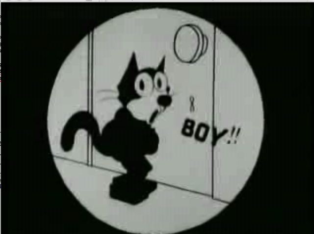
The first of a tiny number of closeups of Felix in the cartoon; he's actually given lip synch, which is weird, since it's a silent cartoon, but I guess if the word is visible, the lips need to be too...


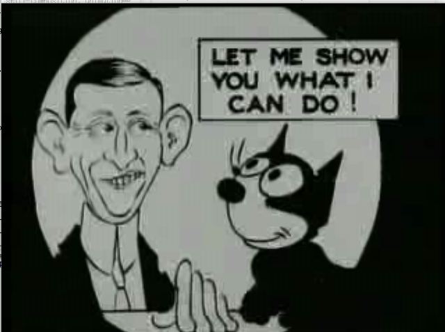
Grotesque caricature of a guy (someone famous?); again, these break up the monotony of the boringness of Felix. My assumptions here are that the differently drawn caricatures would have been recognizeable at the time to the audience (altho it's possible these were inside caricatures and only Chaplin was meant to be recognizeable); it's at least lost on me now...


Cross eyed Felix in Iris. Highlight that action...


Uglyman 2. After no closeups, we're left with weird matted iris close ups. And honestly, they're pretty boring themselves...


Uglyman3 (the boss) with Felix. Apparently, Al Gore ran a movie studio in the '20s.


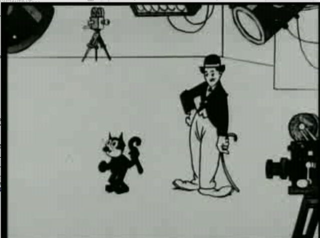
Self referentiality; it's always good to throw this kind of thing in the face of someone who's talking about post-modernism.


Weird iris onto gun of caricature; sure, they were too inept (or thought so badly of their audience) that they didn't use a straight cut, but at least it's different from the rest of the cartoon.


Felix grabs daggers from the mosquito's eye and duels with it. Again, surreal like the bag bit earlier. Again lets you smash a theory based grad student .


Hate:


No perspective bankruptcy sign; isn't the perspective in the shot perfectly clear. I mean, what the hell, is this being animated by like one guy in a week? Oh, it was kinda like that? Well, that certainly explains it.

One thing animated at a time. OK, something's happening! You, react! Now hold it... hold it... hold it... hollllllld it... Now you do something and let the cat watch... watch... watch... waaaaaaaaatch...

What's a close up? While there are few notable closups in the cartoons (all together), the cartoon mainly is full of middle distance shots, and isn't full of what is a completely normal convention now. I assume there were technical limitations (or conventional limitations) on closeups at the time in live action film, thus the weird mattes on every closeup there is in the short. If that's not the case, then there's some messed up idea going on in the composition, which I suppose may be due to comic strip conventions as well (tho a quick flip through The Smithsonian Colleciton of Newspaper Comics doesn't produce a lingering impression of such a stark landscape).


Stiff lines fluttering into the store.Super stiff composition, animation that looks like crap (I hope it's not the loss into the format).

"You say you like black. You say you like white. I'm on board so far, but what is this "gray" you speak of?". Pretty much just black and white in this (a very few exceptions, mostly in limited areas). It's interesting as a change, but it starts to feel bad after awhile. I assume grey takes longer to get right, so it was ignored...


Felix says "watch me register sorrow", but it's very wooden. Followed by a very fluid rip off of Chaplin (after saying "now here's something original"). I hate Chaplin. Maybe it's infecting me hating this particular thing.

The cartoon really drags on. The cartoon plays like two almost unrelated cartoons; 4 minutes for the first part; about a minute bridge; followed by 4.5 minutes of another cartoon (the first segment begins with bridge related material). The overall structure is painful as a whole, because each of the two main sections feels complete by themselves. You reach a logical conclusion then the bridge material hits and it feels like the cartoon is going on too long. Then the second main part hits and that feels like a secondary overlengthening. It makes me wonder if they had individual animators doing each of the sections completely by themselves; in other words, tell A to make a cartoon where Felix earns money to get to Hollywood, and tell B to make a cartoon where Felix has gotten to Hollywood and is trying to be a star. Whatever the idea was, it doesn't work here.

July 19, 2006

Ren and Stimpy Lost Episodes: Not the Cartoons

This is on everything about the Ren and Stimpy Lost Episodes except for the cartoons themselves...

Love:


The intro/interview contents. There were lots of things that were interesting that wouldn't necessarily fit into a commentary track. Wonderful horrible stories.

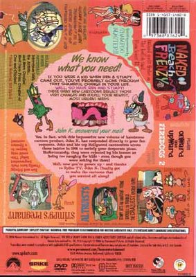
The cover art. It's high time pretty girls were alerted to the dangers of tanning to their woman hides, and the horrific epidermis on the redhead on the cover is an object lesson in this. The many lines on Ren and Stimpy are cool too, and Ren's torso looks like it was carved out of a tiki head, which seems odd, but looks really good in the art.

Nice DVD case. It has locks on the side, and a hinged wing type dealie in the case for the first disc. Unless these locks are about to break off; there's white plastic visible on the hinges already; if they tend to break off, changes this to hate.

Pleasant paintings from Ren Seeks Help on the discs. The discs look good.


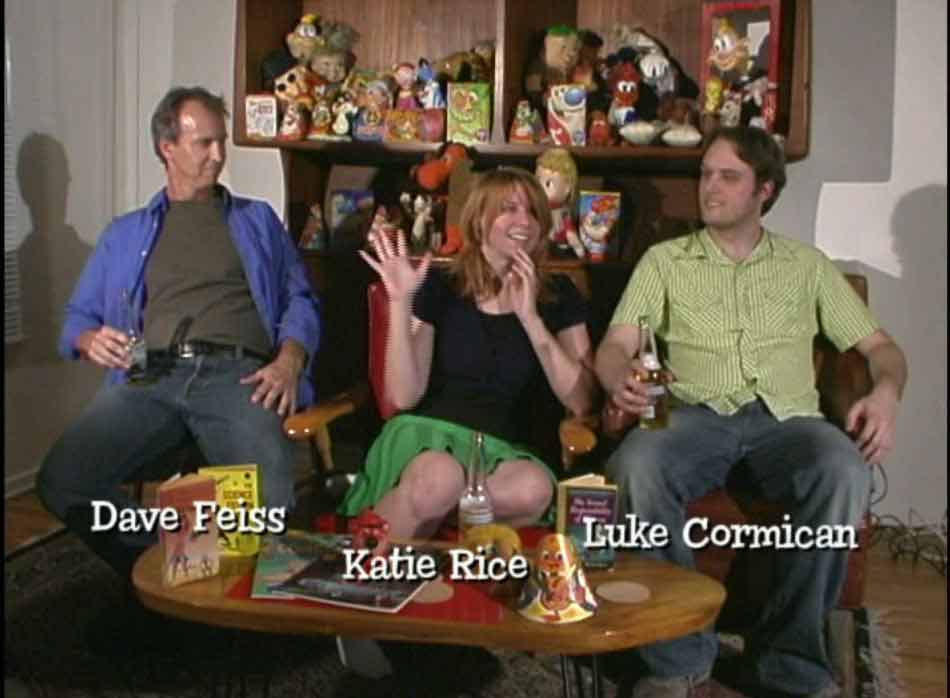
Shot composition on the Naked Beach Frenzy interview with a beer bottle right between Katie Rice's legs. Fatty Arbuckle would be pleased, altho he would likely deny it to the authorities.

The side by side animatic and normal episode of all of Ren Seeks Help. Much more satisfying than the short snippets we normally get. The other episodes should have had this as well.

Hate:


No explanation: nothing in the packaging or labeling tells you where the cartoons are. Instead of an insert that tells you where things are, you get a pointless note from John K. and a picture of him with his hands in his pockets and clip art that doesn't quite go along with the picture. Great. Hope you remember where things are; not even the disc art helps, since each disc has a different painting from Ren Seeks Help...

No direction to the text. The back cover is full of inconsistent text direction; so the snippets about the cartoons are not readable in a flow.

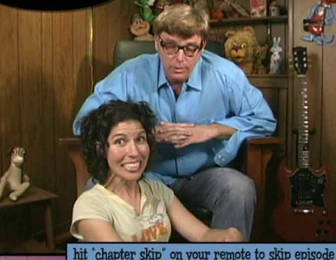
Lies. The front cover says "this unit contains only official John K. product", and yet the first thing you are compelled to watch on the first disc, even before the standard forced legal warning, is ads for South Park. You have to avoid them repeatedly using whatever it is you use to hit your remote buttons.

No option for playing episodes while completely avoiding introductory comments. If you want to smoothly watch the episodes, you don't get that option; it's like cutting from the girl to Ron Jeremy all the time...

Bad image quality on the extras. It looks cheaply shot and cheaply lit.

Even worse sound quality on the extras. It sounds like the interviewees are not mic'ed; probably just a single mic on or near the camera. Probably a good assumption based on the constant sound of the tiny dog walking around (when he scratches himself, it sounds like the camera operator is engaging in self abuse; I really hope it was the dog, anyway), or the calamitous din of what sounded like a pyramid of Heineken bottles falling over. As opposed to people's comments, which often could not be heard.


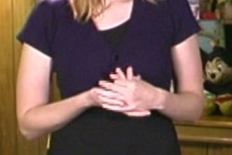
Katie Rice trying to tear off her fingers in the Naked Beach Frenzy opening. I either acclimated to it later or she stopped doing it, but in that first opening it seemed like she was going to pop one of her digits off of her hand, throw it at the camera, and run screaming from the shot.

No followup on John K going to Katie Rice's 15th birthday party.


The physical composition for the intro to Stimpy's Pregnant. Ann Marie's pretty head is a tangent to John K's body initially, and her placement continues to be irritating/harrowing as the piece goes on, as she naturally turns towards John and away from the camera to answer his questions.

Weird Al. He didn't have much to say, but the piece went on. This could have been fixed with editing. The bit about his wife hating the cartoons (X3) was good, so were a couple of other things. But on balance, not good as presented.

Lack of case unity with the previous releases. While the case and art are (largely) good, it doesn't match the three previous recent Ren and Stimpy box sets in style or execution.

No commentary tracks (or if there is, the packaging didn't bother telling me where that was). I manually checked several of the episodes; no dice. I like the interviews just fine, but it's no substitute for commentary tracks.

Easter eggs. Nothing wrong with easter eggs, but most of them should have been explicitly findable extras, especially the cut bit from Onward and Upward.