February 12, 2009

Egg Cracker Suite (1943)

Lantz


This is the last Oswald cartoon made (barring perhaps a cameo or two, which would not be an Oswald cartoon as such). It may also be the worst Oswald cartoon made; it's at least the worst I've seen, tho I've probably only seen 10%.

Note this title is what appears on the Columbia House tape these images are from (Woody Woodpecker and Friends The Collector's Edition Chew Chew Baby) , but it is not the original, presumably because of the "Universal Presents" in the title (and even then, it would depend on the print, as Universal seemed involved in the Columbia House release):
http://lantz.goldenagecartoons.com/1940s/eggcracker-title.jpg

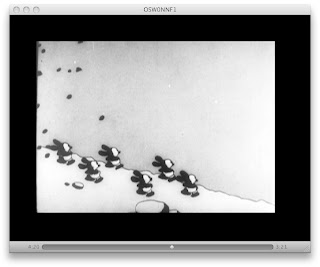
This is a short trying, logically enough, to cast a rabbit (and by "a" I mean "army") in the role of Easter Bunny production workers. Presumably Oswald is the one in suspenders directing the other rabbits, but since this is his only theatrical appearance with this particular generic MGM rabbit look, it's hard to say. While everything lists this as an Oswald cartoon, it doesn't note that in the credits, at least not on the Columbia House release. There's a sign on a tree saying "To Oswald's Easter Egg Factory", and I suppose that's eough internal evidence.

Hate:


Awful washed out Disney color scheme. It could be the print, but based on an original background from the cartoon I own, I don't think so. The colors are not an issue in the black and white shorts, with the stark black or white Oswald reading clearly, but here the rabbits are not stark, in black, white or color. Andy Panda was black and white (and with red pants of a brighter red than Oswald's overalls), and Woody Woodpecker had his bright color scheme Washed out backgrounds allow such characters to pop. Here it is as if they took nature's plan, i.e., rabbits need to hide in their surroundings, and applied it whole heartedly. And it is a failure.

It's not just the colors; it's also the awful washed out cuteness. It's more MGM cute than Disney cute, which is probably a better choice. Still hateful tho.


Ugly bunnies. For all their feigned cuteness, they are ugly and wrong.

Oswald has a horrible voice; a weird drawling stop in it, spouting awful fialogue like "come come girls, it's time to go to work".

And there's the reused animation; they used different speeds and broke it up by other animation, but it's still cheatery, and in a way that doesn't look good.


The lame end; a mindless rabbit waving from a parachuting basket.


Love:


Wrinkly Oswald. It's better when they make them intentionally ugly instead of cloyingly "cute".

Classical music; for some reason, they don't keep it up, and switch to big band for the color extraction, which would be fine, except that it fractures the cartoon.


Dumb cluck sign. The drapes look good, and the insult to the pompous hen is good.

tympani for ostrich egg

The almost Woody-like cuckoo. It's not crazy enough sounding tho.

Pissed bunny. Again, better than cute.


The color split. It's a shame the colors aren't better.


The checkered bunny; the checks break up the monotony of the incredibly bland thing it is normally.


The naked come hither ostrich.


The uncolored ostrich faces for movement. Shame about the crappiness of the bunny...

Summary:

Overall, a sour note to end the Oswald cartoons on (supposedly it was the 195th Oswald cartoon). You can see why this, as a testing of the waters for a new Oswald series, would have meant no more Oswalds.
November 25, 2008

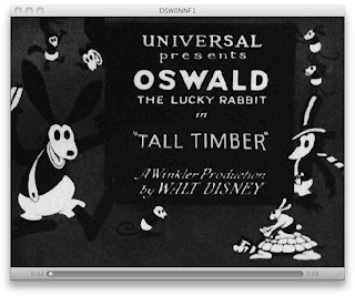
Tall Timber (1928)

Winkler/Disney


Here we have one of the last Disney Oswald cartoons. Also alliterative with its Ts like Trolley Troubles.

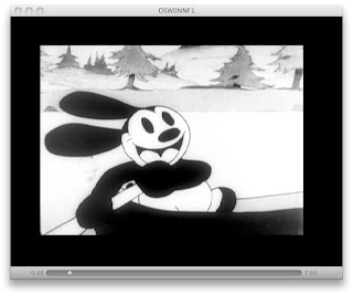
Love: The design is much more cute than it was before. It has rounded shapes instead of harsher, flatter forms.


The music is at least just an organ this time. So, while it is irritating in the way silent film music is irritating, it's better than a fake orchestral arrangement. Again, not the fault of the cartoon itself, but the restoration. In terms of restoring soundtracks on cartoons, Disney would be better off following the axiom that simpler is better.


The backgrounds are far lusher than in Trolley Troubles, tho this cartoon is only a year newer.


A V of ducks is cool. Even if they're in lock step identical movement all at the same time.


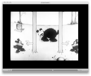
A lack of gun safety or the safety of the audience is sure to lead to entertainment. That's a barrel pointed straight at the screen in the image below.


Fuzzy moose. Always go for the fuzzy moose. Sure, it doesn't look quite right. But it still looks good.


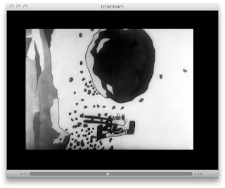
The boulder take. The boulder has a lot of momentum to it (tho it is very floaty, anchored to a spot on screen that it spins on), and the take is unusually extreme for what I usually think of in Disney cartoons.


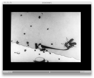
Lightning head effects. It wasn't considered gauche to use visual cues in common with, say, a comic strip. Why did everyone seem to stop using this kind of thing after Tex Avery left MGM except in not consciously noticeable FX frames?


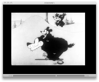
The running bear looks good.


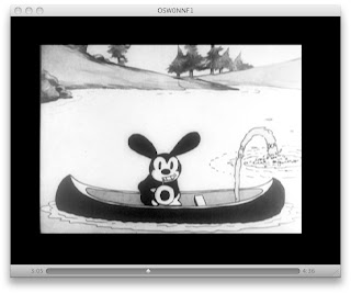
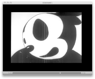
Fish eye lens Oswald: not sure if it's love or hate. It's something tho.


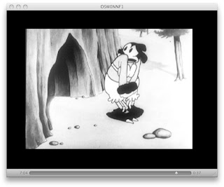
Naked mama bear bloomers and bra


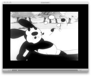
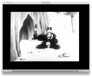
Oswald in the bear coat; except the smoking which is ugly.

Hate: While looking exponentially better than Trolley Troubles, this is still ugly much of the time.

It's still incredibly repetitive.

Oswald crushed into 6 little Oswalds is just poorly done. It's like they'd heard the idea, and just floatily executed it. There is much floatiness to the cartoon's action, actually.

The long bear hold. While the little bears keep moving, the big bear just stays and stays and stays like it went to the Stepford Etiquette Academy.


So, TT is much better than, uh, TT was. But if this was reinventing the wheel 80 years ago, the novel nature is lost in standards that became entrenched and enhanced. A reasonably decent and semi-watchable cartoon.

Next time, we will skip to the end of the story, and then eventually wade back into the middle (which is better than the beginning or end, at least in its best moments of its hundreds of cartoons) of Oswald's animated bio.

November 06, 2008

Trolley Troubles (1927)

Winkler/Disney


So, here we have Trolley Troubles, the debut Oswald the Lucky Rabbit cartoon (at least the first to show; supposedly a cartoon called Poor Papa was made and rejected; this is the first extant example, and can be found on the Disney Treasures Oswald collection). This is the face that launched a thousand ships?

Love:

The running trolley. This is literal; it's trying to use its wheels like feet.

The trolley widening to the fit the tracks. And thinnening to also fit the tracks. And it's in an animated background coming-at-the-camera shot. Too bad it repeats jokes within its tedious length several times.


Nose thumbing.

Goat ramming.


Butt waggling

Nice animated hills. The grey gives it a real mass and 3D feel the characters lack. The trolley has a good feel too, as it tosses the ugly little passengers off.

Under car shot

Vicious rabbits foot

The Oswald ass end.


Hate: Incredibly irritating music (courtesy of Robert Israel and the Robert Israel Orchestra). To be fair, this is not the fault of the original cartoon itself, but of the "restoration". It's also easily remedied by turning off the volume. I wonder why people scoring silents mostly use the same incredibly boring sound. This score is even using multiple instruments; if it was just a piano or an organ, I could maybe forgive it. But to use a form of instrumentation that would only have been used in the grandest of presentations, in a tiny handful of luxury theatres? You may as well go whole hog, ignore the sounds of the era, and make something good instead.
(For an example of one of those rare showings, see
http://www.cartoonbrew.com/disney/colony-theatre-92427 )

Incredibly repetitive animation. The opening scene repeats the same animation of kids catapulting off part of a trolley 6 times.


Repetitive design: those kids above are all the same rabbit.

The next shot repeats a cycle of kids climbing up the side of a trolley and going off to the left (down across a window where it is never seen), then another kid climbing up and going off to the right, ten times. Not 5 for each direction. 10 times for each direction (actually 9; the last going right is absent). Now, to be fair, Oswald himself is oiling the trolley's troll-hole, and some unlucky rabbit's face. But this ugly repetition is in service to the idea that if everything is always moving, that's good (enough). (The weird mutilated wheels on the trolley are interesting tho).


The overall awful ruralness of it all. Would there have been trolleys for bumpkins? My impression is the Toonerville Trolley (which had been a strip for almost 20 years before this short and had had something like 17 shorts made 5 years earlier than this short; gosh, I wonder where they got the idea for Trolley Troubles?) was similarly horribly rural, but I haven't seen any of Toonerville since watching the Oswald shorts.

Repetitive tunnel shots, even if the silhouette is cool.


I'm not sure exactly how this gave Winkler faith in the Oswald series's potential popularity. But then its only the silents that have made their way to me filtered through 80 years of letting bad cartoons slip into nitrate film stock non-existence, and the rise (and fall) of the theatrical short generally and the Oswald series itself more specifically giving me better material to compare it to. Look at the post preceding this; the brand in 40 years would retain rabbits and overalls, but would be otherwise unrecognizable. Oswald would go through several unrecognizable changes, and would essentially be dead on screen in only 11 years.