July 19, 2006

Ren and Stimpy Lost Episodes: Not the Cartoons

This is on everything about the Ren and Stimpy Lost Episodes except for the cartoons themselves...

Love:


The intro/interview contents. There were lots of things that were interesting that wouldn't necessarily fit into a commentary track. Wonderful horrible stories.

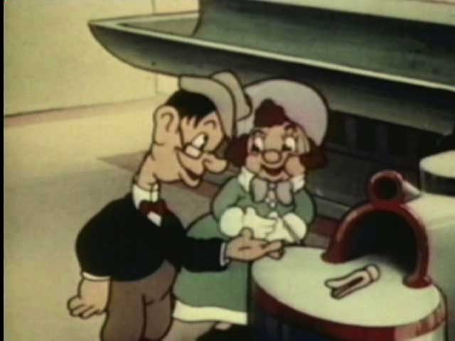
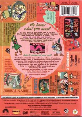
The cover art. It's high time pretty girls were alerted to the dangers of tanning to their woman hides, and the horrific epidermis on the redhead on the cover is an object lesson in this. The many lines on Ren and Stimpy are cool too, and Ren's torso looks like it was carved out of a tiki head, which seems odd, but looks really good in the art.

Nice DVD case. It has locks on the side, and a hinged wing type dealie in the case for the first disc. Unless these locks are about to break off; there's white plastic visible on the hinges already; if they tend to break off, changes this to hate.

Pleasant paintings from Ren Seeks Help on the discs. The discs look good.


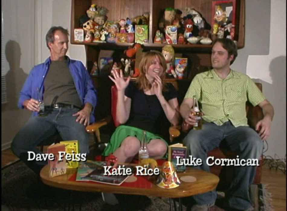
Shot composition on the Naked Beach Frenzy interview with a beer bottle right between Katie Rice's legs. Fatty Arbuckle would be pleased, altho he would likely deny it to the authorities.

The side by side animatic and normal episode of all of Ren Seeks Help. Much more satisfying than the short snippets we normally get. The other episodes should have had this as well.

Hate:


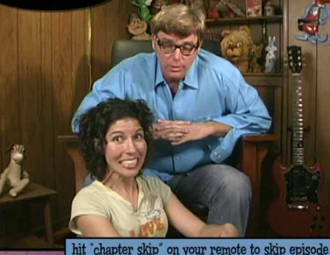
No explanation: nothing in the packaging or labeling tells you where the cartoons are. Instead of an insert that tells you where things are, you get a pointless note from John K. and a picture of him with his hands in his pockets and clip art that doesn't quite go along with the picture. Great. Hope you remember where things are; not even the disc art helps, since each disc has a different painting from Ren Seeks Help...

No direction to the text. The back cover is full of inconsistent text direction; so the snippets about the cartoons are not readable in a flow.

Lies. The front cover says "this unit contains only official John K. product", and yet the first thing you are compelled to watch on the first disc, even before the standard forced legal warning, is ads for South Park. You have to avoid them repeatedly using whatever it is you use to hit your remote buttons.

No option for playing episodes while completely avoiding introductory comments. If you want to smoothly watch the episodes, you don't get that option; it's like cutting from the girl to Ron Jeremy all the time...

Bad image quality on the extras. It looks cheaply shot and cheaply lit.

Even worse sound quality on the extras. It sounds like the interviewees are not mic'ed; probably just a single mic on or near the camera. Probably a good assumption based on the constant sound of the tiny dog walking around (when he scratches himself, it sounds like the camera operator is engaging in self abuse; I really hope it was the dog, anyway), or the calamitous din of what sounded like a pyramid of Heineken bottles falling over. As opposed to people's comments, which often could not be heard.


Katie Rice trying to tear off her fingers in the Naked Beach Frenzy opening. I either acclimated to it later or she stopped doing it, but in that first opening it seemed like she was going to pop one of her digits off of her hand, throw it at the camera, and run screaming from the shot.

No followup on John K going to Katie Rice's 15th birthday party.


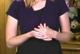
The physical composition for the intro to Stimpy's Pregnant. Ann Marie's pretty head is a tangent to John K's body initially, and her placement continues to be irritating/harrowing as the piece goes on, as she naturally turns towards John and away from the camera to answer his questions.

Weird Al. He didn't have much to say, but the piece went on. This could have been fixed with editing. The bit about his wife hating the cartoons (X3) was good, so were a couple of other things. But on balance, not good as presented.

Lack of case unity with the previous releases. While the case and art are (largely) good, it doesn't match the three previous recent Ren and Stimpy box sets in style or execution.

No commentary tracks (or if there is, the packaging didn't bother telling me where that was). I manually checked several of the episodes; no dice. I like the interviews just fine, but it's no substitute for commentary tracks.

Easter eggs. Nothing wrong with easter eggs, but most of them should have been explicitly findable extras, especially the cut bit from Onward and Upward.

July 14, 2006

All's Fair At The Fair


All's Fair at the Fair is a 1938 Fleischer Brothers cartoon. Strangely, the Fleischer property Popeye would eventually have a cartoon of the same name, but after it passed from Fleischer.

Things to love:


The title card. Look at that fucker. Those are some letters you can count on. I love three dimensional looking title cards; they feel classy to me somehow, altho they're really pretty easy to make.


Artdecotechture! Look at that building facade. Now that's a place I'd like to go to. Whatever happened to this kind of futurism? Did it get replaced with the now futurism of actual instead of imagined technologies? Are we left with CES and E3 now? I don't think it's an adequate substitute.


Smorgasbord of Rube Goldberg devices as the story's engine. Tex Avery used this kind of device to great effect over the next couple of decades with greater and greater refinement, but this non-Avery cartoon is no slouch. Its biggest failing is thinking it needs the couple to drive the action. But this Ikea machine shows you don't need a couple of ugly rubes to make the joke work.


The theme song. I think the song had a larger existence, but it's zippy and catchy.


Signs. Look at the signs. They're great. Look at the signs again. A picture of words is worth... um, something.


Moving... into the future. While I think the cartoon would be better without the bumpkins, the cartoon contains a hopeful air, wherein the ugly country bumpkins are made better looking and generally benefit from the technology at the Fair, culminating with getting a car out of a vending machine (the horse seems to benefit from this as well, altho he doesn't seem to realize he's now out of a job).


Recognizing the subtle downside of technology. There's no big luddite move in the cartoon, but there's some commentary that technology has its dark side. Explicitly turning public transport into sardine cans accomplishes this with a visual joke.

Things to hate:
The voices. Oh, the voices are terrible. You know how Olive Oyl whines? Make it worse and you have the voices here. I'd say the Fleischers were incapable of making a cartoon without jamming something into the throats of all their voice actors, except that Superman and Lois Lane don't sound that way. Maybe they simply jammed something innocuous into those actors. "Hey, if something sounds stupid, the audiences will eat it up! Look at that prick Disney!" The first giant sound cartoon sounds like crap because the dark prince thinks kids like it and the world has to suffer for it for years.


The ugly, ugly leads. It's where troll dolls came from. it's how the Wolverton look doesn't work in animation. I'm thinking maybe it's an accurate abstraction of the ugly, ugly people of the Great Depression as seen in material like the photography of Dorothea Lange. Maybe the spirit of the age was just to show the grotesques.

Pie eyes. They might work on anthropomoprphic characters, but they look like shit on people. At least they do here.


Robots. I love robots; I don't love the robots in this cartoon. First we get a lame sequence of identical shaving robots. These robots are simply boring; they're not actively bad. I can actually see how this look might have influenced the style of Osamu Tezuka (Astro Boy/Tetsuwan Atom), which I do like. The big thing about these is that they're boring, and the super deco look of the backgrounds implies so many more possibilities. Ah well.


It's the dancing robots that actively deserve hate. They're paired with the ugly people and dance a rubbery dance of the lame, while horrifying all comers with their creepy black hair and dead painted on eyes. From the point of view of the future, it's a dystopia extrapolated from the bland grease slicked hair of the films of the '30s.


Summary: A good cartoon on balance. Strangely, the dollar store (and not on Amazon) DVD Fleischer Cartoons Vol. 1 (the version on YouTube) from Eastwest DVD has a better version of the opening, running about twice the length of the opening on the Top 10 Forgotten Cartoons DVD. That second DVD has much better visual quality tho. Based on the size, the forthcoming 5 disc Fleischer box set probably has it, but that remains to be seen (as does the quality if it is on there); at only about $18 tho, it's probably not a bad purchase anyway.