All's Fair at the Fair is a 1938 Fleischer Brothers cartoon. Strangely, the Fleischer property Popeye would eventually have a cartoon of the same name, but after it passed from Fleischer.
Things to love:
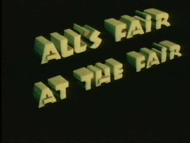
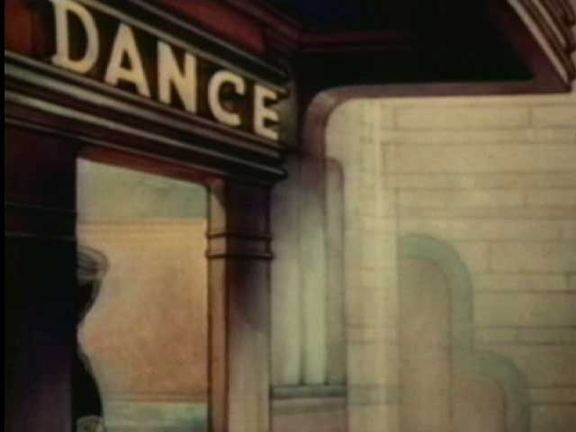
The title card. Look at that fucker. Those are some letters you can count on. I love three dimensional looking title cards; they feel classy to me somehow, altho they're really pretty easy to make.
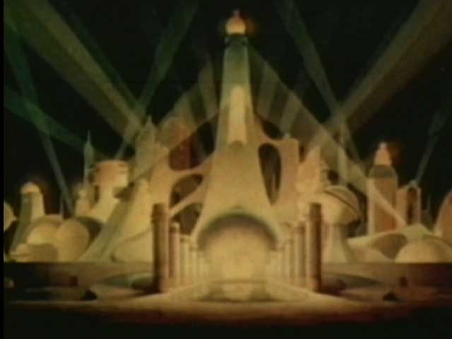
Artdecotechture! Look at that building facade. Now that's a place I'd like to go to. Whatever happened to this kind of futurism? Did it get replaced with the now futurism of actual instead of imagined technologies? Are we left with CES and E3 now? I don't think it's an adequate substitute.
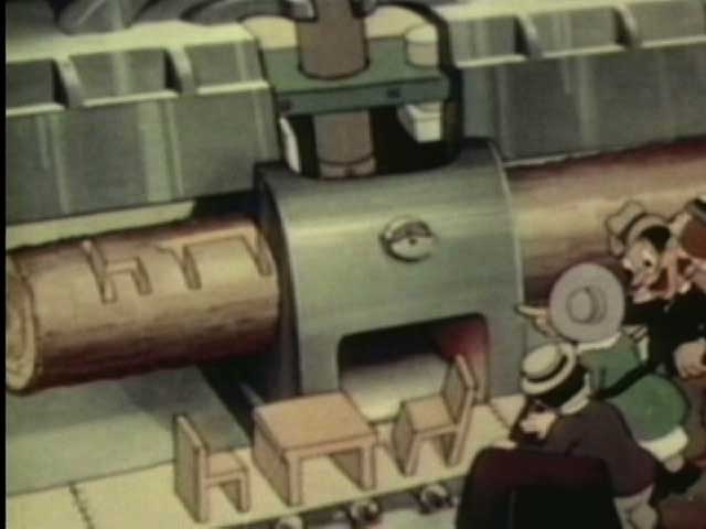
Smorgasbord of Rube Goldberg devices as the story's engine. Tex Avery used this kind of device to great effect over the next couple of decades with greater and greater refinement, but this non-Avery cartoon is no slouch. Its biggest failing is thinking it needs the couple to drive the action. But this Ikea machine shows you don't need a couple of ugly rubes to make the joke work.
The theme song. I think the song had a larger existence, but it's zippy and catchy.

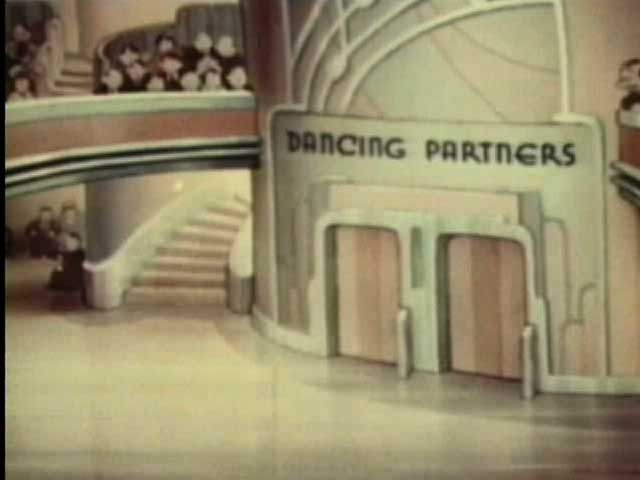
Signs. Look at the signs. They're great. Look at the signs again. A picture of words is worth... um, something.
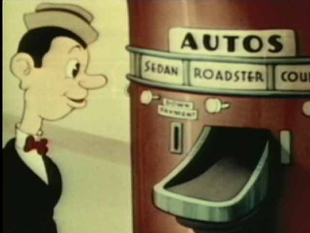
Moving... into the future. While I think the cartoon would be better without the bumpkins, the cartoon contains a hopeful air, wherein the ugly country bumpkins are made better looking and generally benefit from the technology at the Fair, culminating with getting a car out of a vending machine (the horse seems to benefit from this as well, altho he doesn't seem to realize he's now out of a job).
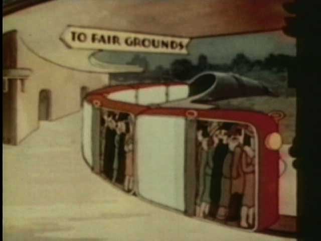
Recognizing the subtle downside of technology. There's no big luddite move in the cartoon, but there's some commentary that technology has its dark side. Explicitly turning public transport into sardine cans accomplishes this with a visual joke.
Things to hate:
The voices. Oh, the voices are terrible. You know how Olive Oyl whines? Make it worse and you have the voices here. I'd say the Fleischers were incapable of making a cartoon without jamming something into the throats of all their voice actors, except that Superman and Lois Lane don't sound that way. Maybe they simply jammed something innocuous into those actors. "Hey, if something sounds stupid, the audiences will eat it up! Look at that prick Disney!" The first giant sound cartoon sounds like crap because the dark prince thinks kids like it and the world has to suffer for it for years.
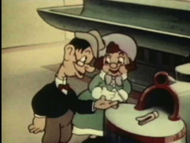
The ugly, ugly leads. It's where troll dolls came from. it's how the Wolverton look doesn't work in animation. I'm thinking maybe it's an accurate abstraction of the ugly, ugly people of the Great Depression as seen in material like the photography of Dorothea Lange. Maybe the spirit of the age was just to show the grotesques.
Pie eyes. They might work on anthropomoprphic characters, but they look like shit on people. At least they do here.
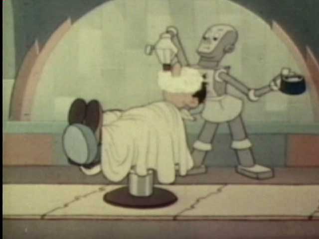
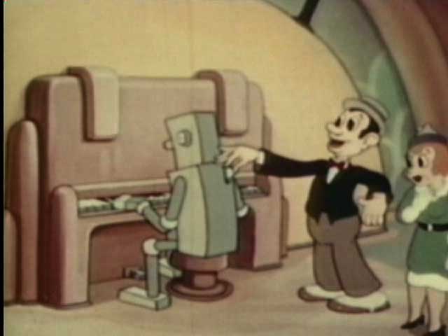
Robots. I love robots; I don't love the robots in this cartoon. First we get a lame sequence of identical shaving robots. These robots are simply boring; they're not actively bad. I can actually see how this look might have influenced the style of Osamu Tezuka (Astro Boy/Tetsuwan Atom), which I do like. The big thing about these is that they're boring, and the super deco look of the backgrounds implies so many more possibilities. Ah well.
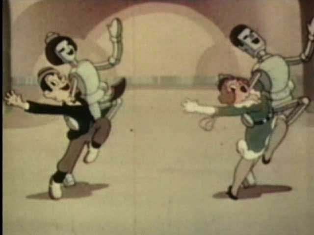
It's the dancing robots that actively deserve hate. They're paired with the ugly people and dance a rubbery dance of the lame, while horrifying all comers with their creepy black hair and dead painted on eyes. From the point of view of the future, it's a dystopia extrapolated from the bland grease slicked hair of the films of the '30s.
Summary: A good cartoon on balance. Strangely, the dollar store (and not on Amazon) DVD Fleischer Cartoons Vol. 1 (the version on YouTube) from Eastwest DVD has a better version of the opening, running about twice the length of the opening on the Top 10 Forgotten Cartoons DVD. That second DVD has much better visual quality tho. Based on the size, the forthcoming 5 disc Fleischer box set probably has it, but that remains to be seen (as does the quality if it is on there); at only about $18 tho, it's probably not a bad purchase anyway.


No comments:
Post a Comment