1923
If the page is functioning, you can download or stream this cartoon at:
http://www.archive.org/details/Felix_inHollywood_NoAudio
Love:

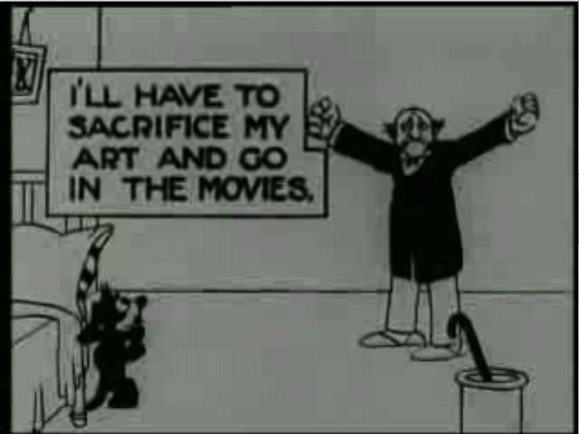
The main title card. It's pretty good; it could be better but the basic idea (of looking interesting) is there.

Lots of weird open spaces. It's unusual to see such big dead spaces. That makes it interesting as a change. It's irritating over time tho.
Freaky word boxes. The action just stops when the word boxes come up. Again, interesting for a change, altho even as a novelty the complete stop to animation during the wordbox is irritating.
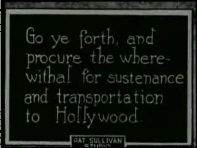
"Go ye forth" intertitle card. Wordboxes and intertitles. Hmmm. I think they'd be better off with just the intertitles. The writing is completely over the top on this one, and that's cool. The lettering is also pleasantly odd, the way the Ls and Ds have right pointing flags and the Hs have left pointing flags. Do those even count as serifs?
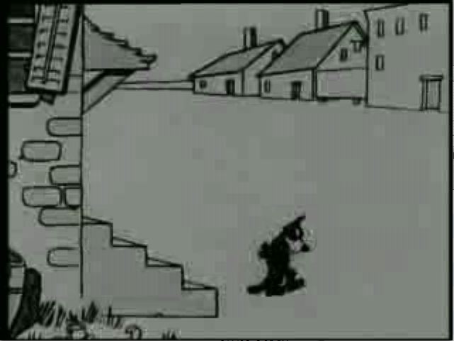
Weird 3D looking background houses. The super flatness of everything else makes them look like Fleischer 3D backgrounds in comparison.

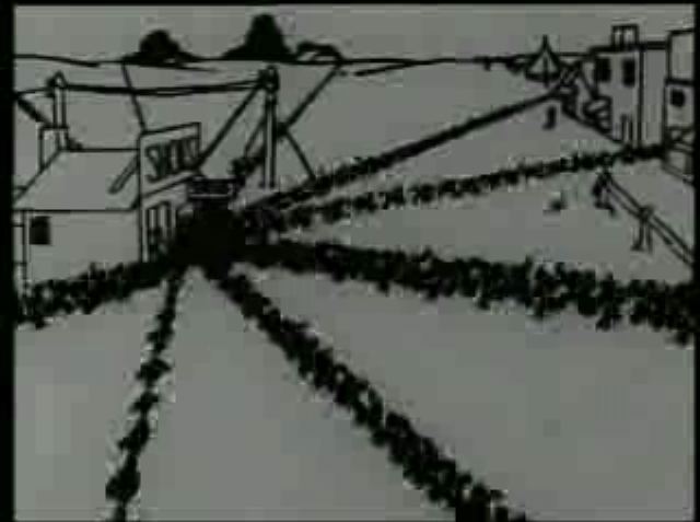
1¢ gum on a pole. Everyone loves 1¢ gum on a pole...
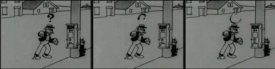
Animated question mark. A nice little animated touch that's expanding on 2D conventions.
Super 3d stars. Every really well done thing sticks out in the film. It's very short tho, and moving so quickly...
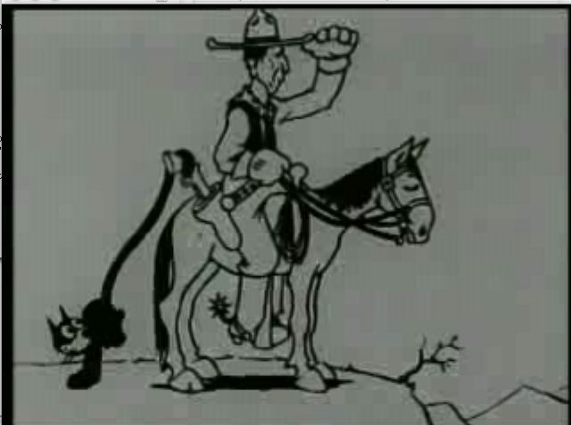
Felix hiding as an umbrella and then a bag. No stills illustrate it well; it's just a cool type of thing (probably way less cool at the time, as that was the kind of thing they seemed to really overuse, and they were banging out a huge number of Felix the cats; at least from the point of view of now, considering the extremely low visibility the Felix cartoons have now; Felix was a huge franchise, until a perfect storm hit and basically killed him in cartoons (if not comic strips) for decades).
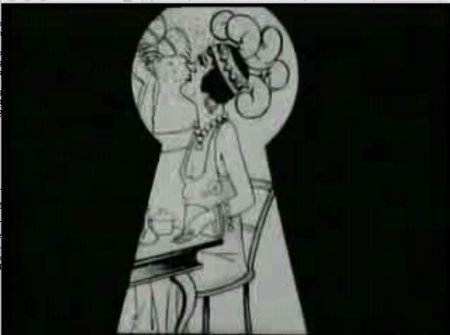
Unidentifiable female star, in a key cutout. It's drawn differently than the rest of the cartoon. And the key matte is interesting.
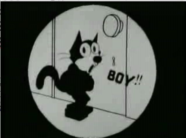
The first of a tiny number of closeups of Felix in the cartoon; he's actually given lip synch, which is weird, since it's a silent cartoon, but I guess if the word is visible, the lips need to be too...

Grotesque caricature of a guy (someone famous?); again, these break up the monotony of the boringness of Felix. My assumptions here are that the differently drawn caricatures would have been recognizeable at the time to the audience (altho it's possible these were inside caricatures and only Chaplin was meant to be recognizeable); it's at least lost on me now...

Cross eyed Felix in Iris. Highlight that action...

Uglyman 2. After no closeups, we're left with weird matted iris close ups. And honestly, they're pretty boring themselves...
Uglyman3 (the boss) with Felix. Apparently, Al Gore ran a movie studio in the '20s.

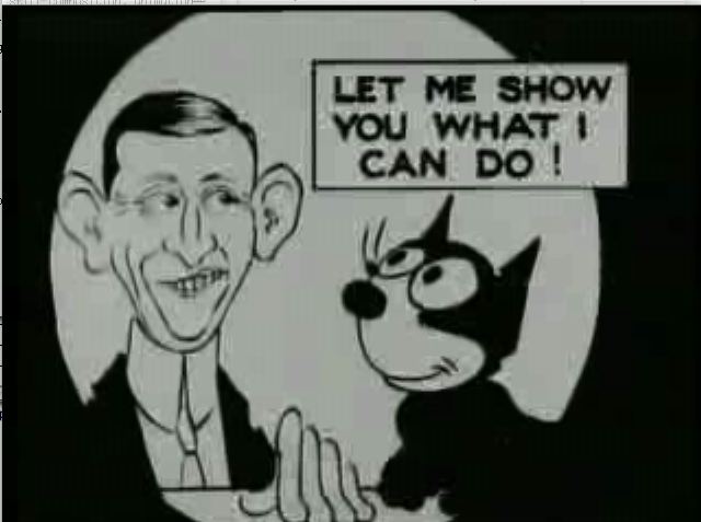
Self referentiality; it's always good to throw this kind of thing in the face of someone who's talking about post-modernism.
Weird iris onto gun of caricature; sure, they were too inept (or thought so badly of their audience) that they didn't use a straight cut, but at least it's different from the rest of the cartoon.

Felix grabs daggers from the mosquito's eye and duels with it. Again, surreal like the bag bit earlier. Again lets you smash a theory based grad student .
Hate:

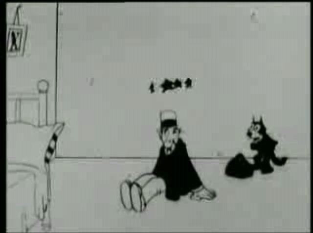
No perspective bankruptcy sign; isn't the perspective in the shot perfectly clear. I mean, what the hell, is this being animated by like one guy in a week? Oh, it was kinda like that? Well, that certainly explains it.
One thing animated at a time. OK, something's happening! You, react! Now hold it... hold it... hold it... hollllllld it... Now you do something and let the cat watch... watch... watch... waaaaaaaaatch...
What's a close up? While there are few notable closups in the cartoons (all together), the cartoon mainly is full of middle distance shots, and isn't full of what is a completely normal convention now. I assume there were technical limitations (or conventional limitations) on closeups at the time in live action film, thus the weird mattes on every closeup there is in the short. If that's not the case, then there's some messed up idea going on in the composition, which I suppose may be due to comic strip conventions as well (tho a quick flip through The Smithsonian Colleciton of Newspaper Comics doesn't produce a lingering impression of such a stark landscape).
Stiff lines fluttering into the store.Super stiff composition, animation that looks like crap (I hope it's not the loss into the format).
"You say you like black. You say you like white. I'm on board so far, but what is this "gray" you speak of?". Pretty much just black and white in this (a very few exceptions, mostly in limited areas). It's interesting as a change, but it starts to feel bad after awhile. I assume grey takes longer to get right, so it was ignored...
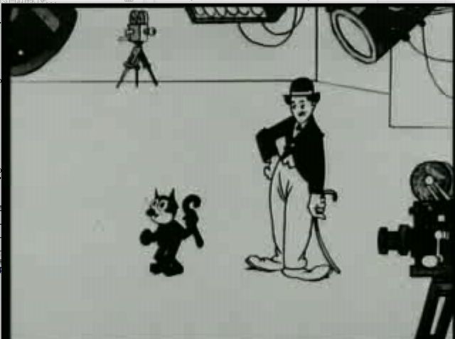
Felix says "watch me register sorrow", but it's very wooden. Followed by a very fluid rip off of Chaplin (after saying "now here's something original"). I hate Chaplin. Maybe it's infecting me hating this particular thing.
The cartoon really drags on. The cartoon plays like two almost unrelated cartoons; 4 minutes for the first part; about a minute bridge; followed by 4.5 minutes of another cartoon (the first segment begins with bridge related material). The overall structure is painful as a whole, because each of the two main sections feels complete by themselves. You reach a logical conclusion then the bridge material hits and it feels like the cartoon is going on too long. Then the second main part hits and that feels like a secondary overlengthening. It makes me wonder if they had individual animators doing each of the sections completely by themselves; in other words, tell A to make a cartoon where Felix earns money to get to Hollywood, and tell B to make a cartoon where Felix has gotten to Hollywood and is trying to be a star. Whatever the idea was, it doesn't work here.


No comments:
Post a Comment